In my last entry, I examined and explained the difference between marginal and effective tax rates. In the midst of the current economic turmoil in the US, and the constant cry from the so-called “99%” I frequently hear that the rich are not paying enough in taxes, and that it’s time they paid their fair share. In learning about the US income tax system and how it works, I ran across several sources of information covering historical tax rates and historical taxes paid. After looking through some of the data and using them to generate some graphs, I’ve come up with a few visual aids to help drive home the following point: The wealthiest Americans ARE paying their fair share, and in the last 30 years the tax burden for all BUT the wealthiest has consistently dropped, while the tax burden for the wealthiest has consistently risen.
Most of the data I used to generate the following graphs comes from the Congressional Budget Office, with supplemental information derived from census data available at census.gov. Before I get into the graphs, I need to define a few terms that folks unfamiliar with statistics may not understand:
Quintile: A quintile is 1/5th of the population of what you are measuring. When I talk about the “lowest quintile” or “highest quintile” I’m referring to the lowest or highest 20% of the population measured.
Deficit: This is another word for shortage, or spending more than you earn.
As I looked at the data from the Congressional Budget Office, I became very curious where the breakdowns were for each of the quintiles of earners in the US. So I headed over to the census bureau where I learned the division of each quartile is as follows:
- First Quintile: Earns up to $20,000
- Second Quintile: Earns up to $40,000
- Third Quintile: Earns up to $65,000
- Fourth Quintile: Earns up to $105,000
- Fifth Quintile: Anyone who earns more
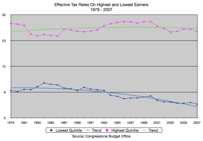
Now, on to the graphs: Up first, a graph of the effective tax rates on the highest and lowest quintile over time. This graph spans from 1979 through 2007 (the newest data available) and clearly shows that while taxes on the top 20% of earners in America has gone up, taxes on the lowest 20% of Americans has declined. The rates on the top 20% have been between 20% and 30%, while the rates on the bottom 20% have moved between 12% and 4%. Also keep in mind that this chart reflects actual taxes paid by these quintiles – after deductions, credits, accountants trying to hide stuff, etc. These are the percentages actually paid in these years.
So, to my friends who insist that the rich are paying less taxes, this is exhibit A. To those of you saying “yeah, well the rates may have gone up, but those rich greedy types have found ways to avoid paying more and more!” – well, you guys can check out the next chart.
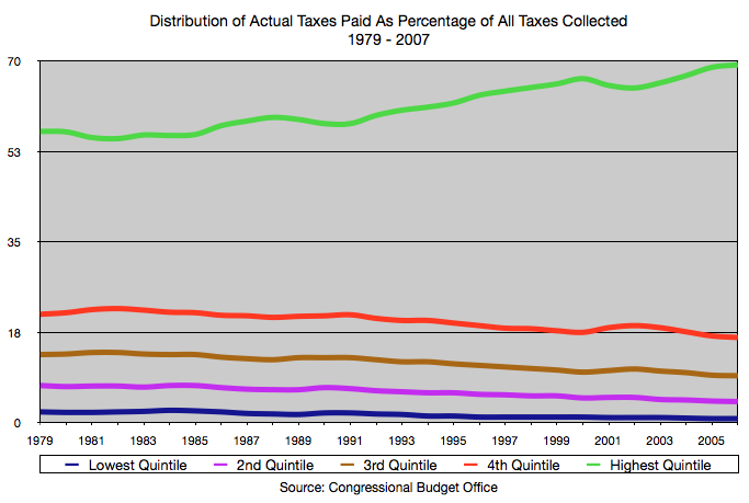
This is a chart of all 5 quintiles of tax payers over the same time period as the previous chart, showing how much of the total percentage of taxes each one paid. In other words, if the US only collected $100 in taxes total, here is who would have to pay how much of the $100.
Notice here again that the top quintile of tax payers has had to pay more and more and more (up from just over 50% of all taxes collected to 70%) while the other quintiles pay less and less? So, for 2007 (the last year in the chart) the top 20% of earners paid for 70% of the tax bill to the government, while the other 80% of the US population only paid about 30% of the taxes.
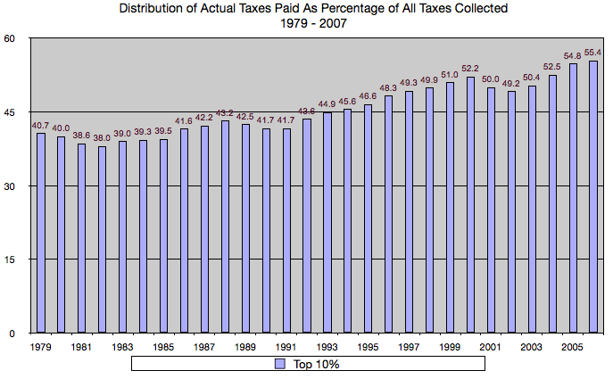
Here is one last graph: Moving away from quintiles for a moment, this one shows the percentage of all taxes paid by the top 10% of all earners in the US over the same time period:
So, in 2007 the top 10% of earners paid 55% of ALL the taxes collected in the US. The other 90% of the population only accounts for 45% of taxes paid. If the trends in this graph continue, the highest incomes will continue to pay more and more of the taxes to fund a burgeoning government filled with more and more social programs and benefits for the lower-income earners.
The liberals among you will scream: “Yeah, but they’re RICH! It doesn’t matter to them at all if they have to pay more in taxes – they can afford it! In fact, they need to pay EVEN MORE, and I should have to pay EVEN LESS!” I just can’t understand this mentality… Keep in mind that the above numbers all focus on income, not wealth. By taxing the highest income earners more and more, the obvious effect is that people will be less motivated to earn more – because they just have to pay more of their earnings in taxes.
The real problem is not that we are not collecting enough in taxes from the rich, it is that the government is spending WAY more than they are taking in. Even if we raised the taxes significantly on the rich, we would not be able to overcome the huge spending deficit that the government has set up.
The rich have been paying their fair share of taxes for years, and have seen that share of tax burden increase over time. It is time to vote in some fiscal conservatives who know how to set and stick to a realistic budget, and who are not afraid to ask some of the rest of us to pay our fair share as well.


Leave a Reply